Web Design Standards
The university’s web standards and best practices are designed to make your website as user friendly and consistent as possible, while providing basic instruction in the use of the central content management system (Omni CMS).
Website Headers and Footers
When creating your webpages, using SJSU-branded header and footer components is required. Having consistent headers and footers establishes a strong SJSU web presence and provides clarity about information to your audience.
Web Colors
Make sure you're using the correct SJSU brand colors on your webpages. Plus, you'll get the added bonus of making sure your page design is consistent with SJSU identity and is accessible to all users.
Spirit Mark Favicon
While the spirit mark is meant to be used for print materials, a favicon version has been created for your website's tab icon, URL icon, or bookmark icon.
Web Editor Tutorials
Dive into our UMC produced video tutorial or explore the entire library on how to build and edit your website.
Tips and Best Practices
Smart Information Architecture
Help users scan and navigate a site without feeling overwhelmed. List six items or fewer for the main navigation of your site.

Say More with Fewer Words
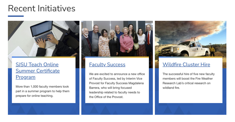
Limit character count throughout your site. In this example, the card components work best with short, clear headlines and brief copy.

Use Authentic Imagery
Avoid stock photography or clip art. The university’s photo library includes assets of our own staff and students.

Homepage Design
The components in Omni CMS are like building blocks you can use to create a compelling landing page that shows off who you are and what you do at SJSU.
Note this example balances image and content, is easy to scan, and embraces mobile-first design.
